Restaurant Digital Menu Photo Placement: Make Pictures Sell Without Clutter
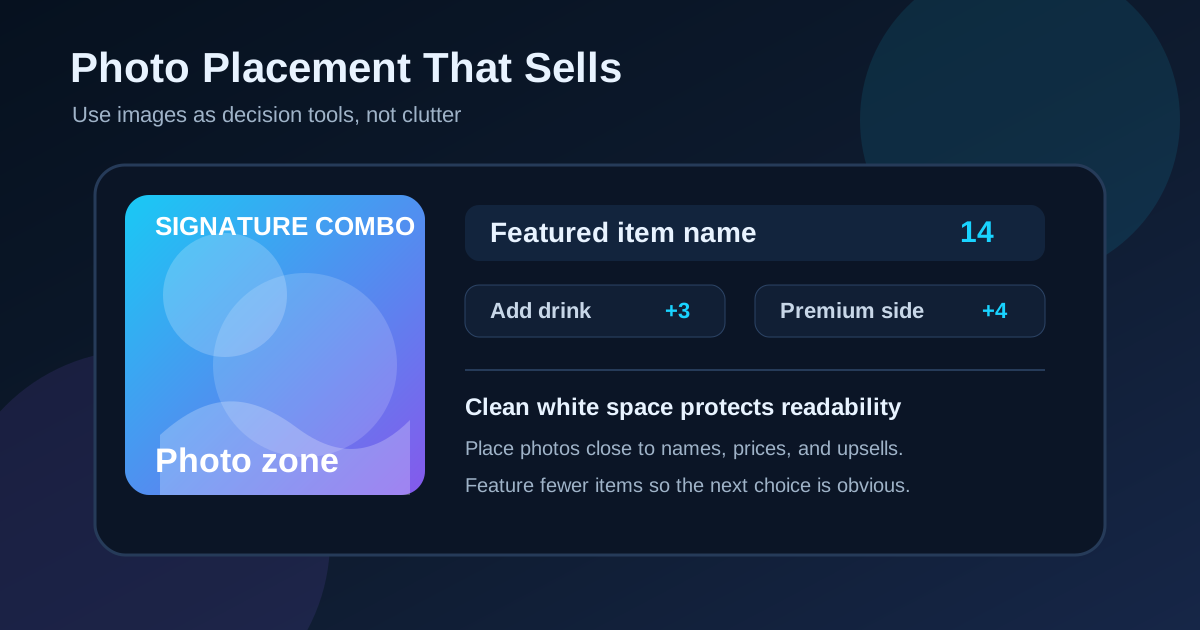
Food photos can make a digital menu board more persuasive, but only when they are placed with discipline. A great picture can help a guest understand portion size, notice a signature item, or feel confident about trying something new. A poor photo strategy does the opposite. It crowds the board, steals attention from prices, slows the line, and makes every item feel equally important.
The goal is not to put a photo next to everything. The goal is to use photos where they remove doubt or guide a better order. Restaurants that treat photos as decision tools usually end up with cleaner screens, faster ordering, and stronger upsells. This guide gives owners and managers a practical way to decide which items deserve photos, where those images should sit, and how to keep the board readable during real service.
Start with the order path, not the camera roll
Before choosing images, map the path a guest follows when ordering. They usually decide in this order: category, item, size or format, modifier, add-on, drink, and dessert. Photos should support that path. If a picture appears before the category is clear, the guest may notice the food but still not know where to start.
Look at each screen from the normal ordering distance and ask what decision the customer is making at that moment. On a counter-service board, a large hero photo might help introduce a signature combo near the top. On a coffee menu, small photos may be more useful for seasonal drinks than for every espresso option. On a pizza board, one clear photo can explain crust style or topping density better than a paragraph of copy.
Give photos a specific job
Every photo should earn its space. A photo can do one of several jobs: show a signature item, explain an unfamiliar format, compare sizes, support a limited-time offer, or make a profitable upgrade feel worth it. If an image does not do one of those jobs, it is probably decoration.
Decoration is risky on menu boards because screen space is limited. A beautiful background image may make the board look polished in a mockup, but it can reduce contrast when the restaurant is busy and customers are reading quickly. Keep decorative imagery away from prices, modifiers, and key category labels. Save the strongest visuals for the items you actually want guests to choose.
Feature fewer items, more clearly
A common mistake is giving every menu item the same photo treatment. When twelve photos compete on one screen, none of them feels special. The board becomes a gallery instead of an ordering tool. Guests still have to read everything, but now they have more visual noise to sort through.
Most restaurants are better served by featuring a small number of items per screen. A three-screen setup might use one large feature image for the primary combo, two medium images for best sellers, and a small seasonal tile. The rest of the menu can stay text-first with strong category labels and clear prices. This approach keeps the board calm while still using photos to steer attention.
Place images near names and prices
A photo should connect clearly to the item it represents. If the image sits far away from the name or price, customers may misread what is included. This is especially important for combos, platters, bowls, pizzas, drinks, and desserts where toppings or sides can change the perceived value.
Keep the item name, short description, and price close to the photo. If the image shows a combo with fries and a drink, the board should say whether those are included. If the photo shows premium toppings, make the upgrade clear. Transparency prevents awkward register moments and helps staff avoid correcting assumptions during rush periods.
Use photo size as a sales signal
On a digital menu, photo size tells customers what matters. The largest image usually feels like the restaurant's recommendation. Use that power carefully. Put larger images on high-margin items, signature dishes, limited-time offers with strong kitchen capacity, or items that need a visual explanation.
Avoid making low-margin or slow-to-prepare items the visual star just because the photo looks good. Menu design should support operations, not fight them. If a dish backs up the kitchen during the lunch rush, do not give it the biggest image at noon. Digital boards make it possible to change emphasis by daypart, so breakfast, lunch, dinner, and late night can each promote the items that make sense for that service.
Protect white space around the image
Photos need breathing room. When text, badges, arrows, and prices sit too close to an image, the board feels crowded and the photo loses impact. White space helps the guest separate one decision from the next. It also makes the board easier to scan from a distance.
Leave space between the edge of a photo and the nearest copy. Avoid placing small prices on top of busy food textures. If text must sit over a photo, use a simple overlay with strong contrast and test it from the customer side of the counter. What looks readable on a laptop may disappear under restaurant lighting.
Update photos when the item changes
Digital menus are easy to update, but photos often lag behind recipe changes. If the kitchen changes bread, sauce, garnish, portion size, cup style, side options, or plating, review the image. An outdated photo can create more customer friction than no photo at all.
Build photo review into the same workflow as price updates. When a manager changes an item, they should check whether the image still matches the offer. For seasonal items, set a removal date before the promotion launches. That prevents old specials from staying visible after ingredients, pricing, or staff training have moved on.
Test the board with a no-reading scan
One useful test is to look at the board without trying to read every word. Notice where your eyes go first, second, and third. If your eyes jump to an item that is not a priority, the photo hierarchy may be wrong. If you notice an image but cannot quickly connect it to a name and price, the layout needs tightening.
Then repeat the test from farther back and during the lighting conditions that matter most. Morning glare, evening reflections, and bright windows can change how food photos look. Dark photos may become muddy. Light photos may wash out. If a photo only works under perfect conditions, it may not be reliable enough for a high-value menu position.
Pair photos with useful upsells
Photos are especially helpful for upsells when they make the upgrade concrete. A drink photo can support a combo. A dessert photo can create a last-second add-on. A premium side photo can show why it costs more than the standard option. The key is to make the upsell feel useful, not pushy.
Place upsell photos near the decision point. If customers choose entrees first, add the side or drink prompt nearby. If dessert is usually an afterthought, reserve a small rotating tile near the lower-right or final scan area. Keep the copy simple: add a drink, make it a combo, try the seasonal side, or finish with dessert. The photo should make the choice easier, not add another paragraph to read.
Create a simple photo placement checklist
Before publishing a new board, review each image with a short checklist.
- Does this photo support a specific ordering decision?
- Is the item name and price close to the image?
- Does the photo show what is included and avoid misleading extras?
- Is this item profitable or strategically important enough to feature?
- Can customers still read the category labels in three seconds?
- Does the image work under real glare and distance conditions?
- Is the style consistent with the rest of the board?
- Is there a review date for seasonal or limited-time photos?
Restaurant digital menu photos should help customers choose with confidence. When images are selected for a reason, placed close to the information they support, and tested from the guest's point of view, the board becomes easier to use and more effective at selling the right items. Strong photo placement is not about making the menu louder. It is about making the next best choice obvious.
Need cleaner food photos on your menu boards?
Zenith Digital Menus designs, installs, and updates digital menu boards that use images strategically while keeping prices and ordering paths easy to read. Contact us to plan your menu setup.