Drive-Thru Digital Menu Readability Checklist for Peak Rush
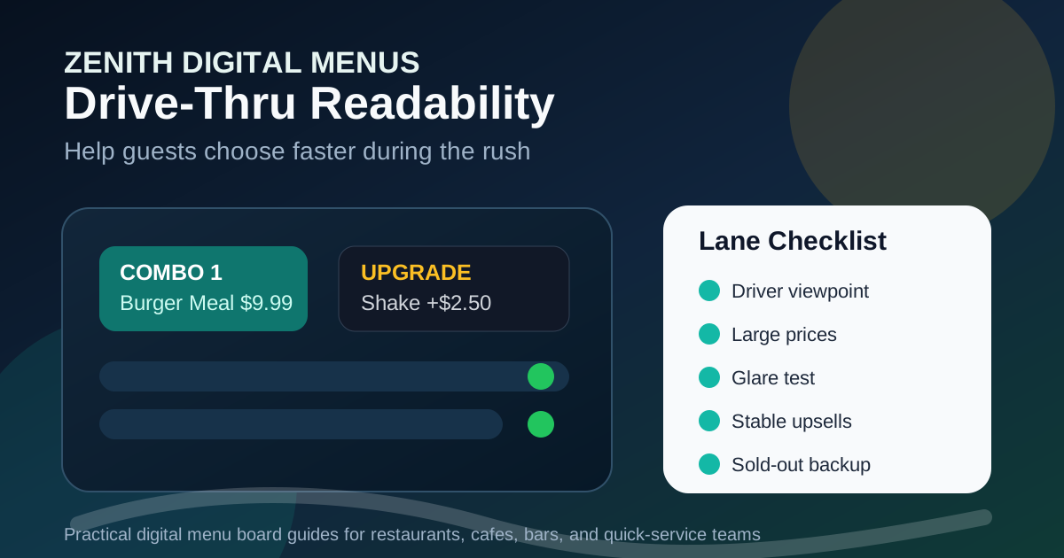
Drive-thru menu boards have one of the hardest jobs in restaurant design. A guest is sitting in a car, often angled away from the screen, possibly dealing with glare, rain, a restless passenger, engine noise, and a line of cars behind them. They need to understand the menu quickly enough to place an order, but confidently enough to avoid mistakes. If the board is crowded, dim, unclear, or constantly changing, the pressure moves straight to the speaker and the staff.
Digital drive-thru boards can solve many of those problems because they allow daypart scheduling, clearer category layouts, timely promotions, and fast updates when an item sells out. They can also create new problems if every screen becomes a rotating ad, every item gets a photo, or prices are too small to read from the decision point. The goal is not to show everything the restaurant sells. The goal is to help the next car make a good decision with as little friction as possible.
Start from the driver viewpoint
The best readability test begins outside, not at a desk. Stand or sit where the driver actually stops before ordering. Look at the board from the normal lane angle, then from the slightly early and slightly late positions that happen during a rush. A design that looks clean straight-on can become hard to read when viewed from the left, through a windshield, or from a higher truck.
Check the menu at the times that matter most. Morning sun, afternoon glare, dusk reflections, wet pavement, and dark winter evenings all change the reading experience. If the board is easy to read only in perfect conditions, it is not ready for peak service. Drive-thru readability has to survive the real lane, not the design preview.
Make the first screen answer the first question
Most drive-thru guests arrive with one main question: what should I order? The first visible screen should guide that decision before it gets into details. That usually means clear categories, a few best-selling combos, a limited-time feature, and obvious paths for drinks, sides, and add-ons. It should not begin with a wall of small item names.
For quick-service restaurants, the first screen may need to separate breakfast, lunch, dinner, drinks, and family meals. For coffee shops, it may need to separate hot drinks, iced drinks, food, and seasonal specials. For pizza shops, it may need to lead with bundles, sizes, and pickup specials. The structure should match how people order in the lane, not how the kitchen stores items in the point-of-sale system.
Use type size as an operations tool
Small type does more than annoy guests. It slows the line because customers ask staff to repeat information, confirm prices, and explain options that should have been obvious. Larger type reduces hesitation, especially for prices, combo names, category labels, and core modifiers like size, protein, sauce, and side choices.
A good rule is to make the items that drive the most orders readable first. Best sellers, combos, and value offers deserve stronger type. Secondary items can be smaller, but they still need enough space to be read without leaning forward. If the only way to fit everything is to shrink the menu, the menu needs editing, not smaller fonts.
Keep photos useful and limited
Photos can help guests decide faster, but too many photos can turn a drive-thru board into a collage. Use images for items that benefit from visual confirmation: signature burgers, premium drinks, desserts, new limited-time offers, or bundles that need to feel like a complete meal. Avoid using equal photo weight for every category.
Every image should look like the item guests actually receive. A photo that exaggerates portion size may win attention, but it creates disappointment at the window. Check image brightness from the lane and remove photos that become muddy under outdoor lighting. One clear hero item often sells better than four crowded images competing for attention.
Put prices where eyes already go
Drive-thru guests should not have to hunt for prices. Place prices near item names, align them consistently, and avoid tiny disclaimers that change the meaning of the offer. If a combo has an upgrade price, make the base price and upgrade rule easy to understand. If a promotional price applies only at a certain time, the time limit should be visible before the guest orders.
Price clarity protects staff too. When the board, speaker script, and register all match, employees spend less time correcting assumptions. If a guest sees one price on the board and hears another at the speaker, the delay affects every car behind them. A clean price system is a speed feature.
Design upsells for timing, not pressure
Drive-thru upsells work best when they appear at the natural decision point. A drink upgrade belongs near combos. A dessert belongs after meals or near the confirmation step. A limited-time add-on belongs near the item it complements. Random upsell panels may look promotional, but they can interrupt the ordering path.
Digital boards make it possible to rotate offers, but rotation should not hide important information while a guest is reading. If an animation or timed panel replaces a core menu section too quickly, the customer may wait for it to come back or ask staff for help. That slows orders. Keep essential ordering information stable and use motion only where it supports attention without removing context.
Match dayparts to real service windows
Breakfast should not disappear while cars are still ordering it, and lunch should not appear before the kitchen is ready. Daypart scheduling needs to match real kitchen capacity, staffing, prep timing, and customer expectations. Build a small buffer around transitions so staff are not forced to explain why the board changed before the line did.
If a restaurant has overlapping menus, the board should make that overlap clear. For example, breakfast available until 10:30 and lunch starts at 10:30 is simple. Breakfast items limited after 10:15, coffee available all day, and select sandwiches available early is more complex and needs cleaner labels. Digital scheduling is powerful, but only when the rules are easy to understand.
Prepare for sold-out items
A drive-thru board should never keep pushing an item that the restaurant cannot serve. If a popular special sells out, replace it quickly with a backup tile, remove the photo, or mark it unavailable in a way that does not dominate the screen. Leaving the promotion live forces staff to disappoint customers repeatedly.
Create replacement content before the rush. A simple fallback such as try our classic chicken combo or seasonal shake sold out, vanilla and chocolate available is better than scrambling during service. Digital menu boards are most useful when updates are planned before problems happen.
Run a five-minute peak rush check
Before calling the drive-thru board finished, run this quick test from the lane:
- Can a driver identify the main categories in five seconds?
- Are combo names, prices, and size options readable from the stop point?
- Does glare or reflection hide any important section?
- Are photos clear, accurate, and limited to useful items?
- Do promotions support the order path instead of covering core menu content?
- Do daypart rules match kitchen readiness and staff scripts?
- Can sold-out items be removed or replaced quickly?
- Does the board match the register, online menu, and speaker script?
Drive-thru readability is not just a design preference. It affects order speed, staff stress, guest confidence, average ticket size, and line throughput. A clear digital board helps guests choose faster, helps staff repeat less, and helps the restaurant promote the right items at the right time. The best drive-thru boards feel simple to customers because the operational work behind them has already been done.
Need drive-thru menu boards guests can read quickly?
Zenith Digital Menus designs, installs, and updates digital menu boards that keep drive-thru ordering clear during real service. Contact us to plan a cleaner menu board.