Restaurant Digital Menu Category Labels: Help Guests Order Faster
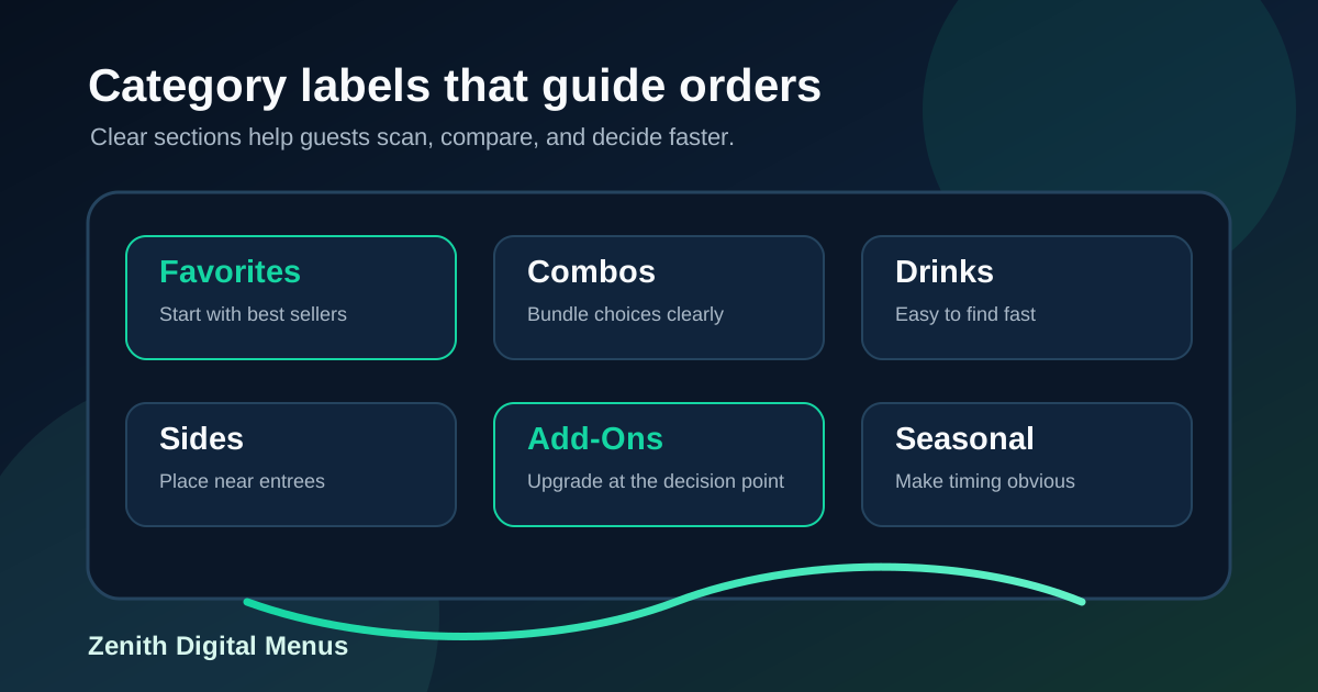
Category labels are easy to overlook because they feel basic. Burgers, drinks, sides, bowls, specials, desserts. Every restaurant already has them somewhere. But on a digital menu board, category labels do more than separate groups of items. They teach guests how to scan the menu, compare choices, understand the ordering path, and move from hesitation to a decision.
When labels are vague, tiny, misplaced, or inconsistent, customers spend more time searching. They ask staff where something is. They miss profitable add-ons. They compare items that should not be compared. During a rush, those small moments stack up into slower lines, order mistakes, and lower confidence at the counter or drive-thru.
A useful digital menu does not simply display a restaurant's item list. It organizes that list around the way real guests decide. Category labels are the signposts. Here is how to make them clearer, more operationally useful, and more profitable without making the board feel pushy.
Start with the customer's first decision
Most menus are organized from the restaurant's point of view. The kitchen thinks in stations, prep lists, POS categories, modifiers, and inventory. Guests think in needs. They want breakfast, something filling, something light, a drink, a family meal, a treat, a deal, or the item they always order.
Before designing the board, list the first three questions a customer usually asks when they arrive. A coffee shop might hear: hot or iced, what is seasonal, what food is available. A pizza shop might hear: whole pie or slices, what size, what special. A burger counter might hear: combo or entree, beef or chicken, what sides. Strong category labels answer those first questions before the guest has to read every item.
This is why labels like Favorites, Quick Lunch Combos, Shareable Sides, Seasonal Drinks, and Kids Meals can be more helpful than generic labels like Menu 1 or Specials. They speak in the customer's decision language.
Keep category names short, but not empty
Short labels work best on screens because they can be read quickly from a distance. But short does not mean vague. A label like Bowls is useful if the category is obvious. A label like Fresh Bowls may be better if the restaurant wants to signal lighter ingredients. A label like Build Your Bowl is better when customization is the key selling point.
The trick is to use the fewest words that still guide the decision. Avoid labels that sound clever but require explanation. If guests need staff to translate a category name, the label is not doing its job. A digital board has limited attention, especially in a line. Clarity usually beats personality at the category level, while item names and descriptions can carry more brand voice.
Use category order to control the scan path
Category labels should appear in the order guests are likely to decide. Put the most common path first. For many counter-service restaurants, that means signature items or combos, then individual entrees, then sides, drinks, desserts, and add-ons. For cafes, it may mean featured seasonal drinks, espresso drinks, cold drinks, food, and retail bags. For bars, it may mean draft beer, cocktails, wine, snacks, and happy hour.
Do not let the POS export decide the order by accident. The board should support the line, not the back office. If guests usually start with combos, put combos where eyes land first. If most profit comes from premium drinks, give drinks a category that is easy to find and visually strong. If sides are often forgotten, place the sides category near the entree area instead of hiding it at the bottom.
Separate permanent categories from temporary promotions
Digital boards make it easy to add seasonal specials, limited-time offers, and event menus. That flexibility is valuable, but it can confuse guests when temporary content looks like a permanent category. If a summer drink is placed beside the regular drink menu with no label, customers may assume it is always available. If a short-term discount is mixed into the main combo section, staff may have to explain when it ends.
Use labels that make timing clear. Try Limited-Time Feature, Summer Drinks, Weekend Brunch, Game Day Bundle, or Available After 4 PM. The label should answer the basic availability question before the guest orders. If a promotion has a hard end date, staff should know it and the menu board schedule should remove or replace it automatically.
Make add-on categories visible at the right moment
Many restaurants hide profitable add-ons in small text. Extra protein, premium sides, sauces, toppings, espresso shots, larger sizes, dessert upgrades, and drink pairings often sit in the least visible area even though they can lift ticket size without slowing production.
The better approach is to give add-ons their own clear label and place it near the item they complement. Good examples include Make It a Combo, Add a Side, Upgrade Your Drink, Try It With, Extra Toppings, and Finish With Dessert. These labels work because they appear at the decision point. They help guests complete the order instead of interrupting it.
Be careful not to turn every category label into an upsell. If everything is shouting, nothing guides. Use one or two strategic add-on categories per screen and keep the rest of the layout calm.
Design labels for distance, glare, and motion
A category label that looks sharp on a laptop may fail on a screen mounted high behind a counter. It may also fail when the restaurant is bright, the screen has reflections, or the customer is standing at an angle. Labels need stronger contrast, larger type, and more spacing than many designers expect.
Give each category enough breathing room so the label is not confused with the first item. Use consistent color, weight, or background treatment across all labels. If the menu uses motion, keep category labels stable. Guests should not lose the section name while reading the items beneath it. Movement can highlight a feature, but the basic map of the menu should stay calm.
Match labels across screens, QR menus, and staff language
Category labels should be consistent wherever customers encounter the menu. If the digital board says Signature Combos, the QR menu should not call the same section Value Meals, and staff should not call it the lunch deal unless that language is also visible. Inconsistent names create small trust gaps. Customers wonder whether they are looking at the same offer.
Consistency also helps staff. When the screen, printed backup, online menu, and POS categories use similar language, new employees can explain items faster. If the restaurant changes a category name, update staff notes and training materials at the same time. The label is not just a design element. It is part of the operating system.
Run a category label audit before the rush
A simple audit can reveal problems quickly. Stand where customers stand and scan the board for ten seconds. Can you name the main sections without reading every item? Can you tell where to start? Can you find drinks, sides, add-ons, and specials? Do temporary offers look temporary? Are premium items easy to compare with standard items? Do staff use the same words that appear on the screen?
Then watch real customers for a few minutes. Notice where they pause, what they ask, and which categories they miss. If guests regularly ask where drinks are, the drinks label is not visible enough. If they miss combos, the combo section may be too low or too crowded. If they ignore add-ons, the label may be appearing too late in the ordering path.
Great category labels are quiet helpers. They reduce reading effort, speed up decisions, and make the menu feel smaller even when the restaurant offers plenty of choices. For restaurants using digital menu boards, improving labels is one of the fastest ways to make the whole system easier to use. Start with the customer decision path, keep the wording direct, place labels where eyes already go, and review them during real service conditions. The result is a menu that feels clearer to guests and easier for staff to support.
Need digital menu boards that are easier to scan?
Zenith Digital Menus designs, installs, and updates menu boards that help guests understand choices faster. Contact us to plan a clearer menu layout.