Restaurant Digital Menu Item Descriptions: Write Copy That Helps Guests Decide
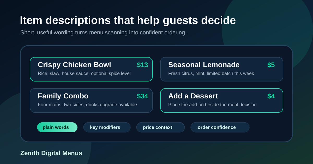
Item descriptions have a hard job on a restaurant digital menu board. They need to explain enough for guests to feel confident, but they cannot turn the screen into a wall of text. They need to make food sound appealing, but they also need to protect speed during a lunch rush, drive-thru line, or crowded counter service shift.
A good description is not decorative copy. It answers the question that would otherwise go to the cashier: what is in this, how is it different, is it spicy, is it enough food, and what should I add to it? When descriptions answer those questions in a short, consistent way, guests order faster and staff spend less time explaining the same items all day.
The best digital menu descriptions are built for scanning. They use plain words, controlled length, smart placement, and a consistent pattern across categories. Here is a practical way to write them so the menu feels clearer, not busier.
Start with the decision the description must support
Before writing any line of copy, decide what the guest needs to understand. Some items need ingredient clarity. Others need portion clarity, heat level, dietary notes, or value comparison. A burger may only need the protein, cheese, sauce, and one signature topping. A bowl may need the base, protein, sauce, and whether it is warm or cold. A family meal may need serving size before anything else.
This keeps descriptions from becoming mini advertisements. If the item name already says Classic Cheeseburger, the description does not need to repeat classic, juicy, delicious, handcrafted, and satisfying. It needs to tell the guest what makes it orderable: double patty, cheddar, pickles, grilled onions, house sauce. Useful details beat vague praise.
Use a repeatable description formula
Consistency makes a digital board easier to read. If every description follows a different pattern, guests have to re-learn the menu with each item. Choose a formula by category and stick to it. For sandwiches, try protein, key topping, sauce, bread. For bowls, try base, protein, vegetables, sauce. For drinks, try flavor, sweetness, size or temperature. For combos, try included items, upgrade option, serving cue.
For example, a bowl description could read: rice, grilled chicken, cucumber, pickled onion, garlic sauce. A drink description could read: strawberry, lemon, mint, lightly sweet. A combo description could read: entree, fries, fountain drink, upgrade to specialty drink. These lines are not flashy, but they are fast to process.
Keep most descriptions under one short line
Digital menu screens are viewed from real distances, not from a laptop preview. Long sentences often look acceptable during design review and then become unreadable when mounted above a counter. As a rule, keep most descriptions short enough to fit on one clean line at the intended screen size. If an item requires more explanation, consider whether the item name, category label, photo, or staff script should carry part of the work.
Long descriptions also create layout problems. They force smaller type, uneven card heights, crowded prices, and inconsistent spacing. That makes the whole board feel harder to scan. A concise description helps one item, but it also preserves the rhythm of the entire menu.
Write in plain food language
Restaurant teams often know too much about their own menu. They may use kitchen terms, supplier names, prep methods, or internal shorthand that guests do not understand. Digital menu descriptions should use words customers can process quickly. Say grilled chicken instead of marinated poultry breast. Say spicy mayo instead of signature aioli if spicy mayo is what guests recognize. Say feeds four if that is the question families ask.
This does not mean the menu has to sound bland. A few sensory words can help when they are specific. Crispy, smoky, chilled, roasted, creamy, bright, and charred all tell the guest something useful. Words like amazing, premium, world famous, and irresistible usually add noise unless they are supported by a clear detail.
Flag the details that prevent order hesitation
Some description details matter because they remove friction. Spice level, common allergens, vegetarian options, serving size, caffeine, alcohol, limited availability, and customization rules can all affect the decision. If customers frequently ask whether a sauce is spicy, put that information on the board. If a salad can add protein, make the upgrade visible. If a special is only available after 4 PM, say so near the item.
Do not overload every item with every possible note. Pick the details that change behavior. A small chili icon, a short vegetarian label, or a clear add protein line can do more than a long paragraph. The goal is to prevent the most common questions without turning the menu into a policy sheet.
Use descriptions to support helpful upsells
Upsells work best when they feel like completion, not pressure. Item descriptions can show natural pairings without shouting. A sandwich description might end with pairs well with tomato soup. A bowl section might include add avocado or extra protein. A dessert line might say easy add-on with family meals. These prompts help guests build a better order while keeping the main decision simple.
Place upsell language near the decision it belongs to. A drink upgrade belongs beside combos. Sauce add-ons belong beside wings, tenders, fries, or bowls. Dessert prompts belong near meals, not buried on a separate screen guests may never read. When the description and placement work together, the upsell feels useful.
Match descriptions across the board, QR menu, and POS
Customers notice when the same item is described differently in different places. If the screen says crispy chicken bowl, the QR menu says chicken rice bowl, and the receipt says poultry bowl, people may wonder whether they ordered the right thing. Consistent wording also helps staff answer questions and reduces training friction.
Use one source of truth for item names and core descriptions. The digital board may need a shorter version, while the online menu can include more detail, but the main ingredients, modifiers, and availability should match. When prices or ingredients change, update every customer-facing menu at the same time.
Test descriptions during real service conditions
The only reliable test is whether guests can use the menu while standing where they actually order. Review the board from the customer line, the doorway, and any angle where glare or distance affects readability. Give yourself ten seconds to scan. Can you understand the top sellers? Can you tell which items are spicy, shareable, customizable, or limited-time? Can you find the add-ons without reading every word?
Then listen to staff for a day. The questions they answer repeatedly are clues. If guests keep asking what comes in a combo, the combo description is too vague. If they ask whether a drink is sweet, add a sweetness cue. If they miss an upgrade, move the prompt closer to the main item. Menu copy should improve based on real ordering behavior, not only taste in wording.
Strong item descriptions are short, specific, and operationally useful. They help guests understand the food, choose faster, and add the right extras without feeling pushed. For restaurants using digital menu boards, improving descriptions is one of the fastest content updates to make because it does not require a new menu strategy. Start with the questions guests already ask, write in a repeatable pattern, keep the screen readable, and review the results during service. The menu will feel calmer, clearer, and easier to order from.
Need digital menu boards with clearer item copy?
Zenith Digital Menus designs, installs, and updates menu boards that make restaurant choices easier to understand. Contact us to plan a more readable menu layout.