Restaurant Digital Menu Contrast Plan: Make Boards Readable in Real Lighting
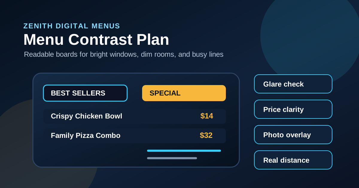
Contrast is one of the least glamorous parts of digital menu design, but it is often the difference between a board guests can use and a board they ignore. A menu can have great photos, strong offers, and accurate prices, yet still fail if the text blends into the background or disappears under glare. Restaurants are not controlled design studios. They have windows, overhead lights, reflections, changing sunlight, crowds, moving lines, and guests reading from awkward angles.
A good contrast plan treats readability as an operating requirement, not a final polish step. It defines which colors are allowed, how text sits on photos, how specials are highlighted, and how the board should be checked in the actual room. The goal is simple: a guest should be able to identify categories, compare items, read prices, and make a decision without squinting or stepping closer.
Here is a practical way to plan contrast for restaurant digital menu boards before the rush exposes the weak spots.
Start with the viewing environment
Contrast decisions should begin with the room, not the brand palette. A board facing large front windows needs different treatment than a screen tucked into a dim bar. A drive-thru display has to survive sunlight, headlights, rain, distance, and short decision windows. A counter-service board may have customers reading from six feet away one minute and fifteen feet away the next.
Walk the space at breakfast, lunch, afternoon, and evening if possible. Look for reflections from windows, glossy tile, stainless equipment, pendant lights, and glass doors. Stand where guests actually stand. If the board is readable only from the perfect angle, the design needs more contrast. This is especially important for prices, modifiers, allergens, and combo details because those are the items guests look for when they are deciding quickly.
Use a limited color system
Many unreadable menu boards start with too many colors. Every badge, category, price, photo overlay, and special gets a different treatment until nothing feels important. A stronger approach is to create a small color system with clear jobs.
Use one dark background, one light text color, one muted text color, one accent color, and one warning or limited-time color if needed. The accent should be reserved for actions and priority messages, not sprinkled across every line. Prices should use a consistent color and weight so guests can compare quickly. Category headers should look related across the whole menu, even if each section contains different food.
This does not mean the menu has to look plain. It means the design has rules. When colors have jobs, guests learn the pattern fast. They know where to find categories, where to find prices, and which offer is being emphasized today.
Do not place small text directly on photos
Food photography can sell, but it can also destroy readability when text sits on top of busy images. A burger photo has highlights, shadows, sesame seeds, sauce, lettuce, and plate edges. If a price or item description lands on that texture, the text may look fine on a laptop preview and fail on the installed screen.
The safer pattern is to separate photos and text into distinct zones. If text must sit over an image, use a strong overlay, a solid panel, or a gradient that creates a calm reading area. Avoid thin white text over bright food, thin black text over charred or dark food, and colored text over mixed backgrounds. Photos should support the choice, not compete with the information needed to order.
Make prices impossible to miss
Guests scan prices differently than descriptions. They often compare several items before reading the details. If prices are too small, too faint, or placed inconsistently, the board slows ordering. Price contrast deserves its own rule.
Keep prices close to item names, align them consistently, and give them enough visual weight to be found quickly. Avoid placing prices in a low-contrast gray just because it looks elegant. Elegant is not useful if the cashier has to answer, how much is that, ten times during lunch. For combos and upgrades, make the base price and upgrade price visually distinct. Guests should know whether they are seeing the full meal price, an add-on price, or a starting price.
Give specials contrast without making them scream
Specials need attention, but they do not need to overpower the whole menu. A common mistake is making every limited-time offer huge, bright, and animated. That may attract attention for a moment, but it can make the rest of the board harder to use.
Create one consistent specials treatment. It might be an accent border, a colored header strip, a dedicated tile, or a small feature panel. Keep the text large and the message short: item name, key ingredient or benefit, price, and availability. If the special has an upsell, place it nearby but do not let it compete with the primary offer. Strong contrast should guide the eye, not turn the board into a collection of ads.
Check contrast for modifiers and disclaimers
Small supporting text often gets neglected. Modifiers, spice levels, substitutions, availability notes, and disclaimers are usually designed after the main board is finished. That is why they often end up tiny, pale, or squeezed into the bottom corner.
Not every note deserves the same size as an item name, but important ordering details must remain legible. If guests need to know that a bowl can be made vegetarian, that a drink has free refills, or that a protein upgrade costs extra, the note should pass a real viewing test. If the information is legally or operationally important, do not hide it in decorative microcopy.
Test the board from real distances
A contrast plan is not complete until someone tests it on the actual screen. Previewing on a laptop is useful for layout, but it does not reveal brightness, glare, viewing angle, or how type behaves across the room. Put the menu on the display, step back to the customer line, and read it in the same conditions guests will face.
Use a simple test. Can you read the category headers in two seconds? Can you find the best seller section? Can you compare three prices without moving closer? Can you read the special while another person is standing near the counter? Can older guests or guests with weaker eyesight use the board comfortably? If the answer is no, increase contrast, simplify the background, enlarge the type, or reduce competing elements.
Adjust brightness with the daypart
Contrast is affected by screen brightness. A board that looks crisp at night may wash out during lunch. A board that is bright enough for daytime may feel harsh in a dim dining room after sunset. If the setup supports scheduling, consider different brightness settings or slightly different designs by daypart.
Breakfast and lunch boards near windows may need bolder backgrounds and stronger type. Dinner menus may benefit from lower brightness but still need clear price contrast. Bars and breweries should be careful with low-light ambiance because guests still need to read the menu from their seat or from the ordering line. The room can feel warm without making the menu hard to use.
Build a repeatable contrast checklist
The best contrast plan becomes part of the update workflow. Before any new menu, special, or price change goes live, run a short checklist: category headers readable, item names readable, prices consistent, photo overlays controlled, specials clear, modifiers legible, glare checked, and staff questions reviewed. This takes a few minutes and prevents many avoidable problems.
Keep screenshots of layouts that work well in your space. Over time, the restaurant builds a small library of proven patterns for lunch specials, seasonal drinks, combo boards, and drive-thru panels. New updates get faster because the design team is not guessing every time. They are working from contrast rules that have already survived real service.
Digital menu contrast is not just a design preference. It affects line speed, order confidence, upsell visibility, staff workload, and customer experience. When the board is easy to read in the actual restaurant, guests make decisions faster and staff spend less time explaining what the screen should have made obvious. Start with the room, use a disciplined color system, protect text from busy photos, test from real distances, and review contrast every time the menu changes.
Want menu boards guests can read faster?
Zenith Digital Menus designs, installs, and updates restaurant menu boards with readability built into every layout. Contact us to plan cleaner, higher-contrast screens.