Restaurant Menu Board Portion Cues: Help Guests Choose the Right Size
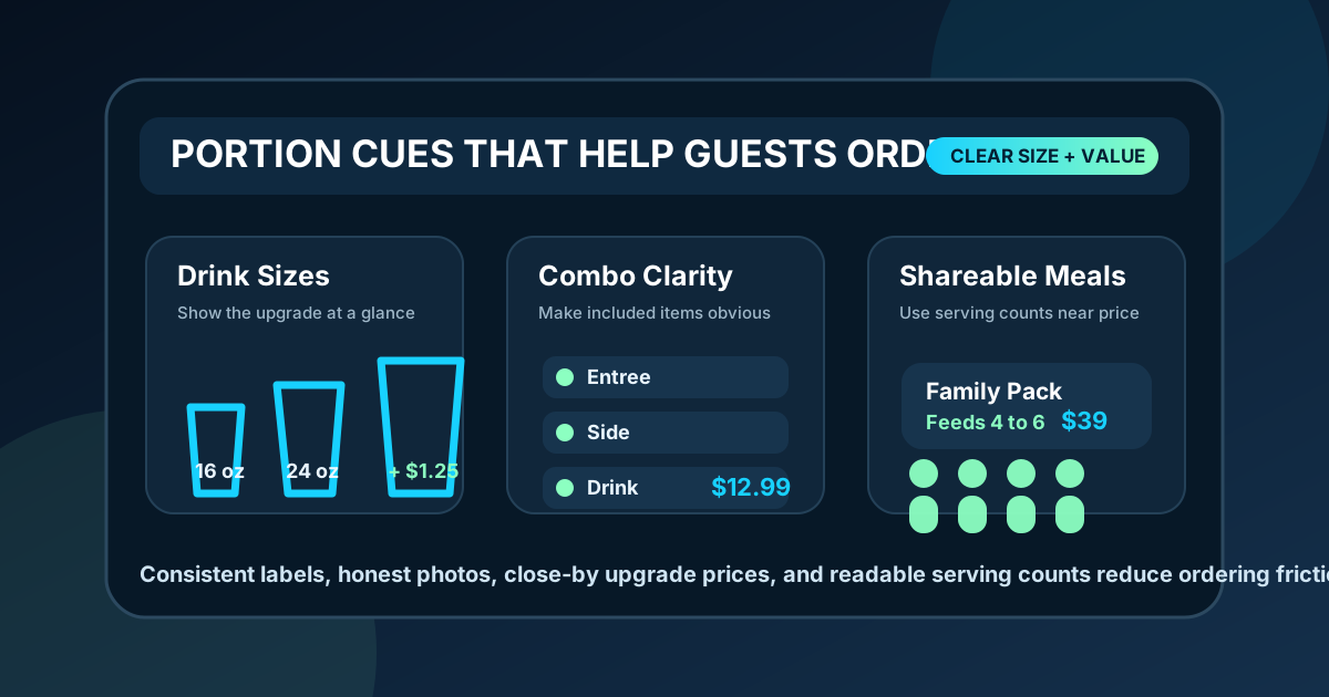
Portion cues are small signals that help guests understand what they are buying before they order. On a digital menu board, those cues might be size labels, cup icons, item photos, ounce counts, shareable tags, side-by-side combo tiles, or short notes like serves two. They seem simple, but they can make a big difference in how fast guests decide and how confident they feel at the register.
Restaurants often focus on price, photos, and specials first. Those matter, but portion clarity is just as important. If guests cannot tell whether a bowl is light or filling, whether a large drink is worth the upgrade, or whether a family meal feeds three or five, they either ask staff more questions or choose the safest option. Both outcomes can slow service and reduce average order value.
A useful menu board gives portion information without cluttering the screen. The goal is not to explain every detail. The goal is to answer the size and value questions that come up most often, especially during busy service when staff have less time to clarify.
Start with the items guests compare most
Not every menu item needs a portion cue. Start with the categories where guests regularly compare sizes, value, or fullness. Drinks, sides, bowls, salads, wings, pizza, family meals, kids meals, and combo upgrades are common candidates. These are the places where a small amount of extra information can prevent hesitation.
Look at staff questions for a week. If customers keep asking whether the regular fries are big enough to share, whether a salad comes with protein, or how many tacos are in a plate, that belongs on the board. Menu design works best when it solves real ordering friction instead of adding decorative information.
Use consistent size language
Guests should not have to decode a new system in every section. If drinks use small, regular, and large, avoid switching to classic, signature, and jumbo for sides unless there is a strong reason. Consistent labels make comparisons faster. They also make staff training easier because the same words appear on the screen, the register, and the receipt.
If your restaurant uses ounce counts, keep them readable and secondary. The label should do the first job, and the measurement should confirm it. For example, Regular 16 oz and Large 24 oz is easier to scan than leading with only numbers. If ounces do not help the guest, use practical language instead: single, shareable, family, half tray, full tray, or feeds 4 to 6.
Show portions visually, but do not overdo it
Digital boards are good at showing size differences visually. A simple row of cup silhouettes, pizza slices, bowl icons, or side containers can communicate relative size faster than a paragraph. The key is restraint. Icons should support the item name and price, not become another layer of noise.
Use the same icon style across the board. A small, medium, and large drink should look like a set. A wing count should be shown in a clean badge or line of text, not in a busy illustration that competes with the food photo. Visual portion cues work best when they are instantly understood from the customer line.
Pair portion cues with upsells carefully
Portion cues can improve upsells when they help guests see the value of an upgrade. A drink upgrade, extra protein, larger side, or combo conversion should be placed close to the item it improves. Guests should not have to search across the board to understand the next step.
Keep the upsell specific. Instead of Upgrade today, write Make it a combo: add fries and a drink. Instead of Bigger size available, write Large drink +$1.25. Clear language feels helpful rather than pushy. It also helps cashiers because the board has already introduced the option before the guest reaches the counter.
Make shareable and family portions obvious
Shareable portions need extra clarity because guests are often ordering for a group. A platter that serves two people should not look like a single entree, and a family meal should not require a staff explanation every time. Use direct labels like Serves 2, Feeds 4, or Good for 3 to 5 depending on the item.
For family meals, list the main components in a compact structure: protein, sides, drinks, sauces, and any included bread or dessert. If substitutions cost extra, say so near the meal rather than hiding it in a bottom note. Families and groups make decisions quickly when they can see what is included and what will cost more.
Avoid misleading food photos
Photos are powerful portion cues, but they can also create disappointment. If the image shows extra garnish, a larger serving dish, or sides that are not included, guests may feel misled. The best menu photos match the actual item as served, especially for combos and premium upgrades.
When a photo is meant to show appetite appeal rather than exact portion size, support it with text. A short note such as entree only, shown with optional side, or combo includes drink can prevent confusion. This is not just about accuracy. It protects trust. A guest who feels the board was clear is more likely to order confidently again.
Keep price and portion in the same scan path
Portion information should sit near the price because guests evaluate those details together. If the price is on the far right and the portion note is buried under the description, the board forces extra scanning. Align size labels, prices, and upgrade amounts in a predictable pattern so guests can compare options quickly.
For tiered items, a simple table can work well: Regular, Large, Family with prices next to each. For combos, use a fixed structure that repeats across the menu: entree name, included items, price, upgrade option. The more predictable the structure, the less effort the guest spends interpreting the board.
Test portion cues with real customers and staff
The fastest way to improve portion cues is to ask staff what guests still misunderstand. After a new board goes live, track repeated questions. Are people asking how many pieces come in an order? Are they surprised by a cup size? Are they unclear about whether a side is included? Those questions show where the menu needs a clearer cue.
Also watch the line. If guests step closer, point at the board, or pause too long between sizes, the cue may be too small or too vague. Fixing one label can have an outsized impact during peak service. A better size note can save a cashier from answering the same question dozens of times a day.
Build a portion cue checklist
Before publishing a new digital menu layout, run a short review. Are the most compared sizes labeled clearly? Are shareable items marked? Are photos accurate? Are upgrade prices close to the base item? Are ounce counts or serving counts readable from the customer line? Are staff using the same language that appears on the board?
Good portion cues make a menu feel easier. Guests know what they are getting, staff spend less time explaining, and upsells feel like practical choices rather than pressure. Start with the items that create the most questions, use consistent labels, keep visual cues simple, and place portion details where guests already look. The result is a digital menu board that helps people order the right amount with more confidence.
Want clearer menu boards for faster decisions?
Zenith Digital Menus designs and updates restaurant menu boards that make size, value, and upsell choices easier to understand. Contact us to plan a cleaner menu layout.