Restaurant Digital Menu Board Heat Map: Put the Right Items Where Guests Look First
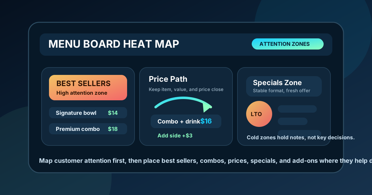
A digital menu board is not just a list of items on a screen. It is a decision surface. Guests walk in, look up, scan a few zones, compare prices, and choose quickly if the layout gives them a clear path. A heat map helps you plan that path before you start moving boxes around in a design file.
In menu design, a heat map is a simple way to mark the areas that get the most attention. It does not need to be scientific eye-tracking research. For most restaurants, it is a practical planning tool that combines customer behavior, line position, screen placement, category order, and staff feedback. The point is to stop treating every inch of the board as equally important.
When the best real estate goes to low-margin items, long descriptions, or decorative graphics, the menu wastes attention. When high-value items are placed where guests naturally look first, the board becomes easier to use and more useful for the business.
Start with the customer line, not the screen
Before deciding where the hot zones are, stand where guests stand. A counter-service line may create one main viewing angle. A cafe may have people reading while they wait behind three other guests. A food hall stall may have traffic passing from both sides. A drive-thru lane has an even tighter decision window because the guest is seated, farther away, and under time pressure.
Mark the first place the eye lands from that real position. On many boards, it is near the upper center or upper left. On a wide multi-screen setup, it may be the leftmost panel because guests begin reading there. On a single screen near the register, it may be the center because that is what lines up with the customer. Your heat map should reflect the room, not a generic template.
Give the hottest zone a clear job
The strongest attention zone should not carry five competing messages. It needs one primary job. For many restaurants, that job is to present the most orderable section: signature items, top combos, best sellers, or the lunch set that most guests need to understand first.
A common mistake is placing a large brand graphic or rotating announcement in the hottest zone. Branding matters, but guests who are already inside the restaurant are trying to order. Use the best space to answer the question they came in with: what should I get, what comes with it, and how much does it cost?
Match hot zones to profitable choices
A heat map becomes more valuable when it connects attention with menu engineering. Identify the items that are both popular and profitable. These are usually the items worth making easy to find. They may be signature bowls, premium sandwiches, drink bundles, combo meals, seasonal beverages, or add-ons with strong margins.
Do not hide those items in a crowded category just because the menu has always been printed that way. If a premium combo is a better business outcome than a single entree, place the combo where it will be noticed before the guest commits. If a house-made drink has better margin than bottled soda, give it a small but consistent zone near the meal choices where it feels like a natural add-on.
Keep cold zones useful but lower pressure
Every board has quieter areas. The bottom corners, far edges, and dense secondary sections often receive less attention. That does not mean they are useless. They are good places for supporting information that guests need after they are already interested: modifiers, extra sauces, allergy prompts, small sides, legal notes, or secondary categories.
The key is not to bury essential ordering information there. If guests must know that a combo includes a drink, do not place that note in the coldest corner. If an upgrade price affects the decision, keep it near the item. Cold zones should support decisions, not contain the detail that makes the decision possible.
Use motion and specials carefully
Digital menus make it tempting to animate the hottest area. A moving special can attract attention, but it can also interrupt scanning. If the board changes while a guest is reading, they may lose their place or miss a price. Motion should be used like seasoning, not as the whole meal.
A better approach is to give specials a predictable zone. Use one feature tile, one accent color, and a short structure: item name, benefit, price, and availability. If the special rotates, keep the location and format stable so guests know where to look. The heat map should guide attention, not create a race between every panel on the screen.
Protect the price path
Guests rarely read a menu from top to bottom like a book. They bounce between category, item name, description, and price. Your heat map should include that price path. If the guest sees an item in a hot zone but has to search elsewhere for the price, the layout creates friction.
Keep prices close to item names, align them consistently, and make upgrade costs easy to compare. Combo pricing should be especially clear because guests often compare the meal deal with the individual item. A strong price path helps people decide without asking the cashier to translate the board.
Plan add-ons near the decision point
Add-ons work best when they appear at the moment they are relevant. A dessert tile at the top of the board may look attractive, but a side, drink, or protein upgrade usually belongs next to the meal it improves. Heat mapping can reveal where guests are already making that choice.
For example, if the center-left section carries the most ordered entrees, a small add-on strip beside it may perform better than a large add-on section at the bottom. The language should be practical: add avocado, make it a combo, add a side, upgrade to large. Helpful placement feels like service. Random placement feels like advertising.
Test the map during real service
The first heat map is a hypothesis. Test it during the rush. Watch where people look, where they hesitate, what they point at, and what they still ask staff to explain. If guests keep asking about an item that is already on the board, the item may be in a cold zone, too small, or surrounded by too much visual noise.
Staff feedback is especially useful because cashiers hear the same questions repeatedly. Ask which items guests miss, which prices cause confusion, and which specials need extra explanation. Then adjust one or two zones at a time. A heat map improves faster when changes are specific and measurable.
Build a repeatable layout rule
Once you know where attention is strongest, turn the heat map into a rule for future updates. For example: top center is for best sellers, left panel is for core categories, right panel is for seasonal feature and drinks, bottom strip is for add-ons and notes. Rules make menu updates faster and keep the board consistent when prices, photos, and seasonal items change.
A restaurant digital menu board should make ordering feel obvious. A simple heat map helps you put the most useful information where guests naturally look, reserve quieter zones for supporting details, and connect attention with items that matter to the business. Start with the real customer line, assign each hot zone a clear job, protect the price path, and use staff feedback to refine the layout over time.
Want a menu layout that guides attention?
Zenith Digital Menus designs and updates restaurant menu boards with clear zones for best sellers, combos, specials, prices, and add-ons. Contact us to plan a cleaner digital menu layout.