Restaurant Digital Menu Price Anchoring: Help Guests Compare Value Fast
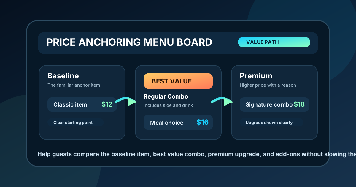
Guests rarely read a restaurant menu from top to bottom. They scan, compare, and decide under time pressure. Price anchoring gives that scan a clear structure by showing guests what a normal choice looks like, what a better value looks like, and what a premium choice adds. On a digital menu board, this matters because the screen has limited space and the line keeps moving.
Good price anchoring is not about tricking customers. It is about making value easier to understand. If a guest sees a single sandwich for $12, a combo for $16, and a premium combo for $18 with a specialty drink, they can judge the tradeoff quickly. If those choices are scattered across the board, the guest has to do mental work while staff wait for the order.
A useful digital menu board makes the comparison obvious. The design should place related choices near each other, keep prices close to the item names, and explain the upgrade in a few words. Done well, price anchoring supports higher average tickets while also making the ordering experience calmer.
Start with the item guests already understand
The strongest anchor is usually a familiar core item. For a burger restaurant, that might be the classic burger. For a cafe, it might be a regular latte. For a pizza shop, it might be a medium cheese pizza. This item gives guests a baseline for price, portion, and category.
Place that baseline where the category begins. The goal is not always to make it the largest or most colorful item. The goal is to make it easy to find, easy to read, and easy to compare against the next option. If the classic burger is $11 and the signature burger is $14, the board should help guests see what the extra $3 includes.
- Use the core item as the first reference point in each category.
- Keep the baseline item visually calm and readable.
- Place premium versions close enough for instant comparison.
- Explain the added value with short wording, not long descriptions.
Group choices by decision, not by kitchen spreadsheet
Many menus are organized around internal operations. That can make sense for prep, but it can create weak customer comparisons. A guest does not think in inventory groups. They think, "Do I want the regular version, the bigger version, or the meal?" Digital menu boards should reflect that decision path.
Instead of separating every sandwich, side, drink, and upgrade into distant zones, create comparison clusters. A cluster might show one main item, a combo version, and one premium upgrade. This helps the guest understand the value ladder without reading the entire screen.
For example, a chicken sandwich board could show: Classic Chicken $12, Make It a Combo $16, Spicy Deluxe Combo $18. The anchor is the classic item. The middle choice adds a clear meal value. The premium choice adds a reason to spend a little more. The prices make sense because the benefits sit beside them.
Make the middle option easy to choose
In many restaurants, the middle option is the most important sales tool. It is usually not the cheapest item and not the highest priced item. It is the option that feels safe, complete, and easy to justify. On digital menu boards, the middle option often works well as a combo, regular size, or house favorite.
Design can support this without looking pushy. Use a small label such as "Popular," "Best Value," or "Guest Favorite" if the claim is truthful. Give the middle option enough visual weight to be noticed, but do not bury the rest of the menu. The point is to reduce indecision, not force every guest into the same order.
- Use one value label per category, not five.
- Keep the label near the item name, not floating far away.
- Show the value difference clearly, such as "includes fries and drink."
- Avoid tiny disclaimers that make the offer feel complicated.
Keep prices close to the value statement
Price anchoring fails when the price and the value are separated. If a guest reads a combo name on the left and has to scan across a crowded board to find the price on the right, the comparison slows down. Digital menu design should make the item, value cue, and price feel like one unit.
This is especially important for add-ons. A line like "Add avocado +$2" or "Upgrade to specialty drink +$3" works because the value and cost are connected. If the add-on price sits in a separate footnote, guests may miss it or ask staff to explain it during the rush.
Use consistent price placement within each category. If prices are right aligned for sandwiches, keep them right aligned. If upgrade prices appear in accent text below the item, repeat that pattern. Consistency lets guests learn the board quickly.
Use premium anchors carefully
A high-priced item can make nearby choices feel more affordable, but it has to earn its place. A premium anchor should be real, desirable, and easy to understand. It might be a family meal, a loaded specialty item, a larger shareable size, or a limited-time premium special.
The mistake is adding a high price just to make everything else look cheaper. Guests notice when a menu feels artificial. The premium item should show a clear benefit: larger portion, better ingredients, extra toppings, bundled sides, or a seasonal feature. If staff cannot explain why it costs more in one sentence, the board probably cannot either.
Test anchors from the customer line
Price anchoring should be tested in the real ordering environment. Stand where guests stand. Look at the screen for five seconds. Ask what the cheapest complete meal is, what the most popular choice is, and what the premium upgrade includes. If those answers are not obvious, the anchor system needs work.
Staff feedback is useful here. Cashiers hear the same questions repeatedly. If customers often ask what comes with a combo, whether a side is included, or why two sizes cost different amounts, the board is not showing value clearly enough. Those questions are not annoyances. They are design notes.
Review anchors when prices change
Price anchoring is not a one-time layout task. Ingredient costs, portion sizes, seasonal specials, and customer habits change. Each price update should include a quick value check. Does the combo still make sense next to the single item? Does the premium item still feel worth the difference? Are add-ons still priced clearly?
A simple quarterly review can prevent awkward gaps. Print or export the current menu, circle each baseline item, underline the middle value choice, and mark each premium option. If a category has no clear comparison path, fix that before the next busy season.
Restaurant digital menu price anchoring works best when it respects the guest. Give people a clear baseline, show useful upgrades, keep prices near the value, and test the board from the actual line. The result is a menu that helps customers decide faster and helps the restaurant promote the right items without adding pressure.
Want clearer price comparisons on your menu board?
Zenith Digital Menus designs restaurant menu boards with readable pricing, clear combo structure, useful upgrade zones, and simple customer decision paths. Contact us to plan a digital menu that makes value easier to see.