Restaurant Digital Menu Zone Planning: Guide Attention Without Clutter
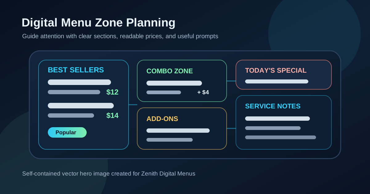
A strong digital menu board is not just a list of items on a screen. It is a guided path through the decisions a guest needs to make before ordering. When the board has clear zones, customers can understand the menu faster, compare the right options, and notice the items the restaurant most wants to sell. When the board has weak zones, everything competes at once. Best sellers look like regular items, specials fight with categories, add-ons float in random corners, and guests ask staff questions the menu should have answered.
Zone planning is the practice of assigning each part of the menu a job before the design is polished. One area may introduce the main categories. Another may feature high-margin best sellers. Another may explain combos. Another may hold limited-time offers, dietary notes, or pickup instructions. The exact layout depends on the restaurant, but the principle is the same: every screen area should earn its place by helping the guest decide.
This is especially useful for counter-service restaurants, cafes, pizza shops, burger concepts, dessert shops, and quick-service operators where customers have only a short time to scan. A thoughtful zone plan can make a digital board feel calmer while still doing more work.
Start with the order path
Before arranging menu sections, map the order path from the guest's point of view. A first-time customer may need to know what the restaurant serves, which items are popular, how the meal is built, and what the price includes. A returning customer may jump straight to favorites or specials. A rushed customer may look only for the easiest complete meal.
The best zone plan supports all three behaviors. Put the most common decisions in the most visible places. If most guests choose an entree first, then add a side and drink, the board should follow that flow. If the restaurant sells build-your-own bowls, the board should show the steps in order. If combos drive the business, combo logic should be visible early instead of hidden in small text at the bottom.
A useful exercise is to write the board's jobs before opening the design file. For example: explain categories, highlight three best sellers, make combo upgrades clear, show prices consistently, promote one seasonal item, and answer the most common staff question. That list becomes the foundation for the zones.
Give best sellers a dedicated home
Restaurants often know which items guests love, but the menu design does not always reflect it. Best sellers may be buried alphabetically or mixed into long lists where they look no different from slower items. A digital board can fix that by giving favorites a dedicated zone.
This does not need to be huge. A "guest favorites" tile, a top row, or a small featured panel can be enough. The key is restraint. Feature a small number of items that are easy to prepare, profitable enough to promote, and representative of the restaurant. If ten items are labeled as favorites, the label loses meaning. Three strong choices are easier to scan and easier for staff to support during a rush.
Pair each featured item with a clear price and, when useful, a short benefit phrase. "Crispy chicken sandwich, spicy honey, slaw" is easier to understand than a clever name alone. Guests should be able to see why the item deserves attention without reading a paragraph.
Separate browsing zones from decision zones
Not every menu area should carry the same visual weight. A browsing zone helps guests explore categories and item names. A decision zone helps them compare final choices, prices, sizes, combos, or add-ons. When these zones are mixed together, boards become harder to use.
For example, a pizza menu might use one zone for specialty pizzas, one zone for build-your-own pricing, and one zone for sides and drinks. A cafe might use one zone for espresso drinks, one for cold drinks, one for breakfast items, and one for seasonal features. A burger shop might place signature burgers in the main zone and keep toppings, sides, and shakes in supporting zones.
This separation helps guests know where to look next. It also gives the design breathing room. The main zone can use larger type and more spacing, while supporting zones can be smaller without feeling like an afterthought. The result is a board that feels organized instead of packed.
Keep add-ons near the items they improve
Add-ons sell better when they appear in context. A premium topping list at the bottom of the screen may be technically visible, but it is easy to miss. A small add-on prompt near the related item is usually more helpful. Put avocado near bowls and sandwiches, extra espresso shots near coffee, dipping sauces near wings, and dessert upgrades near combo meals or family packs.
Context also reduces confusion. Guests can see what the add-on applies to and how much it costs. Staff do not have to explain every option from memory. If an add-on applies broadly, consider a compact supporting zone labeled "popular additions" with clear prices. Avoid scattering badges across every item. Too many prompts make the board feel like a wall of sales messages.
Reserve one zone for timely information
Digital menus are valuable because they can change. That does not mean every part of the board should change constantly. A better system is to reserve one zone for timely information: seasonal specials, limited-time offers, sold-out notes, event items, weather-based promotions, or daypart changes.
This zone should have a consistent location and style. Guests learn where to look for what is new, and staff know which part of the board needs review before service. Keep the copy short. A timely zone should answer what the item is, why it matters, the price, and when it is available. If it needs a long explanation, it probably belongs on a QR menu, table tent, or staff script instead of the main board.
Make prices part of the zone plan
Price placement is not a detail to solve at the end. It affects how guests compare options. If prices move around from section to section, customers slow down. If combo prices and base prices use the same style, guests may not understand what is included. If upgrade prices are too faint, the final order can feel surprising.
Choose a pricing pattern for each zone. Item lists might use right-aligned prices. Featured items might place the price directly under the name. Combo zones might show the full meal price and the upgrade price in different weights. Add-on zones might use simple plus pricing. The pattern can vary by zone, but it should be consistent within the zone.
Test the zones from the actual line
A zone plan is only successful if it works from the customer's real viewing distance. Put the board on the screen and stand where guests stand. Try to answer a few questions in seconds: What are the main categories? What are the best sellers? How do I make a combo? Where are drinks? What is new today? How much does the item cost?
If any answer is hard to find, the issue may not be the words. It may be the zone hierarchy. Increase spacing, reduce the number of featured items, move add-ons closer to relevant items, or give the timely offer a cleaner container. The goal is not to make every detail bigger. The goal is to make the next decision obvious.
Use a simple zone review checklist
Before publishing a new digital menu design, run a quick zone review. Does every area have a clear job? Are best sellers easy to find? Are add-ons close to the items they improve? Is there only one main timely offer zone? Are prices consistent inside each section? Can a new customer understand the menu without staff explaining the basics? Can the board still be read when the line is moving?
Restaurant digital menu zone planning helps owners turn a screen into a better ordering tool. It protects readability, supports profitable items, and makes updates easier because each area has a defined purpose. When guests can scan the board in a natural order, they make decisions with more confidence. That is good for the customer experience, good for the staff, and good for the average ticket.
Want a digital menu layout that guides guests clearly?
Zenith Digital Menus designs restaurant menu boards with clear zones for best sellers, combos, add-ons, seasonal offers, and readable prices. Contact us to plan a board that is easier to scan during real service.