Restaurant Digital Menu Confidence Cues: Reduce Questions at the Counter
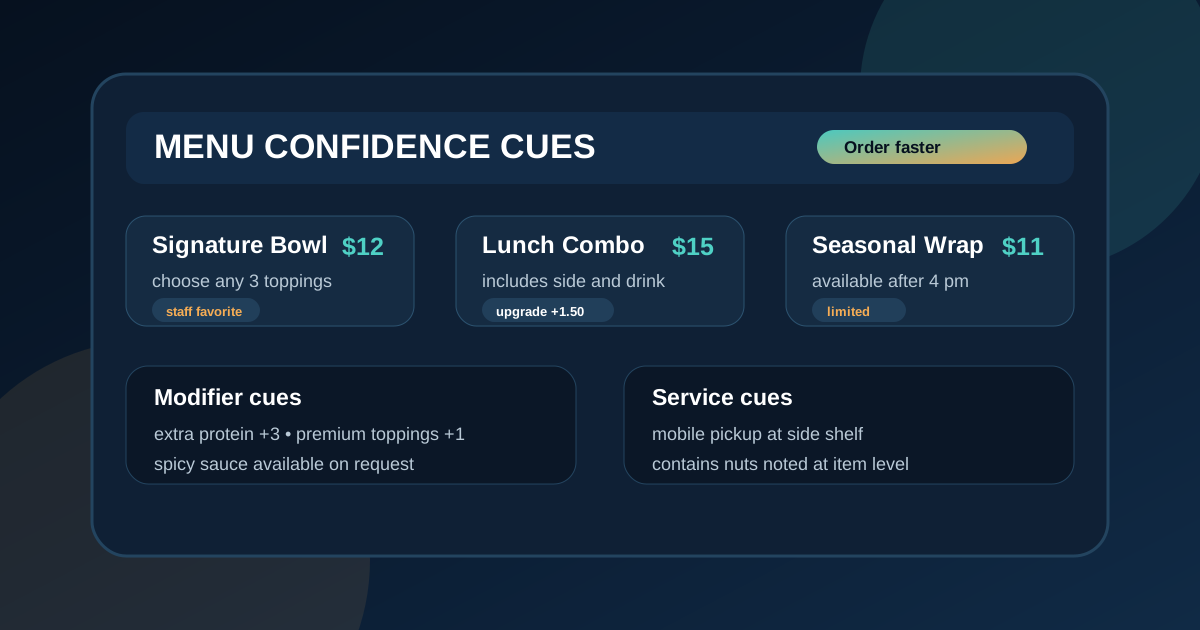
A busy counter is a tough place for a guest to make a decision. The line is moving, staff are juggling orders, and the menu board has only a few seconds to answer the basics. When a customer pauses because they cannot tell what comes with a combo, whether a topping costs extra, how large a portion is, or where online pickup orders go, the problem is not always the food. Often, the menu is missing confidence cues.
Confidence cues are small pieces of information that help guests feel sure enough to order without asking a follow-up question. They are not long explanations or aggressive sales messages. They are simple signals like "includes drink," "staff favorite," "choose any two toppings," "available after 4 pm," "contains nuts," or "pickup at side counter." Used well, these cues reduce friction, make prices feel clearer, and help the restaurant sell the right items without making the board feel crowded.
Digital menu boards are ideal for confidence cues because they can show information exactly where it matters. A printed menu often becomes a wall of footnotes. A digital board can place short cues next to the item, combo, add-on, or service step they clarify. The goal is not to label everything. The goal is to identify the moments where guests hesitate, then give them just enough guidance to continue.
Start with the questions staff answer every day
The best confidence cues come from real service, not guesses. Ask the counter team which questions they answer again and again. Common examples include: What comes with the meal? Can I swap the side? Is this spicy? Is the sauce included? Does the larger size have more protein? Is this item available all day? Where do I pick up a mobile order?
Write those questions down and group them by menu area. Some belong near combos, some near modifiers, some near specialty items, and some in a small service note zone. If a question comes up only once in a while, it may not deserve space on the main board. If it comes up every rush, it probably does.
This step prevents the menu from becoming cluttered with clever but unnecessary labels. A cue should solve a real hesitation. If it does not help a guest decide, compare, or order correctly, leave it out.
Use inclusion cues for combos and meal deals
Combos are often profitable and convenient, but they can create confusion when the included items are not obvious. A guest should not have to search across the board to learn whether a combo includes a side, a drink, a sauce, or a dessert. Use a short inclusion cue directly inside the combo zone.
Examples include "includes fries and fountain drink," "choose one side," "sauce included," or "upgrade drink +1.50." Keep the wording consistent. If one combo says "comes with" and another says "includes," guests may wonder if the meaning is different. Consistency makes the board faster to scan.
Inclusion cues also help protect the staff from repeated explanations. When the cue is visible at the moment of comparison, customers are more likely to choose confidently and less likely to feel surprised at the register.
Add portion cues where size affects value
Portion uncertainty slows ordering. If a guest cannot picture the difference between a regular bowl and a large bowl, or a six-piece and a ten-piece order, they may default to the cheapest option or ask staff for help. A simple portion cue can make the value clearer.
Use plain language instead of vague marketing. "Feeds 1," "great for sharing," "two scoops," "12 oz," "6 pieces," or "adds extra protein" is more useful than "big value" by itself. For family meals, note the practical serving range. For drinks, keep ounces visible. For pizza, show size and slice count if that is how guests compare options.
Do not overdo it. Portion cues should appear where the choice is genuinely hard to compare. If every item carries a note, the notes become background noise.
Make modifier rules visible before the register
Modifiers can be a source of revenue and a source of frustration. Guests want to customize, but they also want to know what is included, what costs extra, and what is allowed. A digital board should make the most common modifier rules easy to understand before the cashier starts entering the order.
For build-your-own concepts, show the sequence clearly: base, protein, toppings, sauce, extras. Add cues such as "choose any three toppings," "premium toppings +1," or "extra protein +3." For sandwiches and burgers, place popular add-ons near the item group rather than hiding them in a separate corner. For coffee and dessert shops, keep milk alternatives, flavors, sizes, and extra shots in a tidy supporting zone.
Guests do not need every possible modifier on the main board. They need enough structure to know how the order works. Detailed edge cases can live in the POS, staff script, QR menu, or printed allergen sheet.
Use dietary and allergen cues carefully
Dietary icons can be helpful, but they must be used responsibly. If the restaurant marks vegetarian, gluten-free, dairy-free, nut-free, or spicy items, the definitions should be consistent and reviewed by staff. A casual icon placed without operational confidence can create problems.
Use clear text when space allows. "Vegetarian," "contains nuts," or "spicy" is easier for many guests than an unfamiliar symbol. If icons are used, include a small legend in the same zone or keep the icons extremely standard. Avoid crowding every item with multiple badges. Mark the cues guests actually ask about and keep detailed allergen conversations with trained staff.
A good rule is to use the board to prompt safer, clearer decisions, not to replace staff judgment. The cue should help a guest know when to ask, when to avoid an item, or when an item fits their preference.
Place service cues where they reduce bottlenecks
Not every confidence cue is about food. Some of the most useful cues explain how service works. In restaurants with online ordering, delivery pickups, self-serve drinks, table numbers, or separate pickup shelves, a small service cue can prevent traffic jams at the counter.
Examples include "order here, pickup left," "mobile pickup at shelf," "grab utensils after checkout," "breakfast served until 11 am," or "late night menu starts at 9 pm." These cues should be short and located where guests naturally look before ordering. A tiny note near the footer may not help if the guest has already walked to the wrong spot.
Service cues are especially useful when the restaurant changes dayparts or runs seasonal workflows. If the pickup process changes during lunch rush, make the cue visible during that time and remove it when it is no longer needed.
Keep cues visually quieter than item names and prices
Confidence cues should support the menu, not compete with it. Item names, prices, and primary categories still need to be the main reading path. Use smaller type, pill labels, subtle accent colors, or compact helper lines so cues are visible but not dominant.
Color should mean something. If yellow always means "popular," do not also use it for spicy items and pickup notes. If red means "spicy," avoid using red for general promotions. A small visual system makes cues easier to learn and keeps the board calmer.
Test the design from the actual ordering distance. If the cues disappear completely, they are too subtle. If they pull attention away from the menu, they are too loud. The right balance helps guests notice the cue at the exact moment they need reassurance.
Review cues during price and seasonal updates
Confidence cues can become outdated if nobody owns them. A combo note may mention a side that changed. A seasonal item may keep an availability cue after the promotion ends. A modifier price may be updated in the POS but not on the board. These small mismatches damage trust quickly.
Add cues to the same review checklist used for prices and item names. Before publishing, confirm that inclusions, upgrade prices, daypart times, allergen notes, and pickup instructions are still accurate. If the restaurant has multiple locations, check whether each cue applies everywhere or needs a location-specific version.
Useful cues make a digital menu feel easier to order from. They answer the small questions that interrupt decisions, clarify value before the register, and help staff keep the line moving. The best boards do not explain everything. They explain the right things at the right moment.
Want a digital menu that helps guests order with confidence?
Zenith Digital Menus designs restaurant menu boards with clear item cues, readable prices, helpful upsell prompts, and practical service notes. Contact us to plan a board that answers the right questions before guests reach the register.