Restaurant Digital Menu Item Prioritization: Feature What Should Sell First
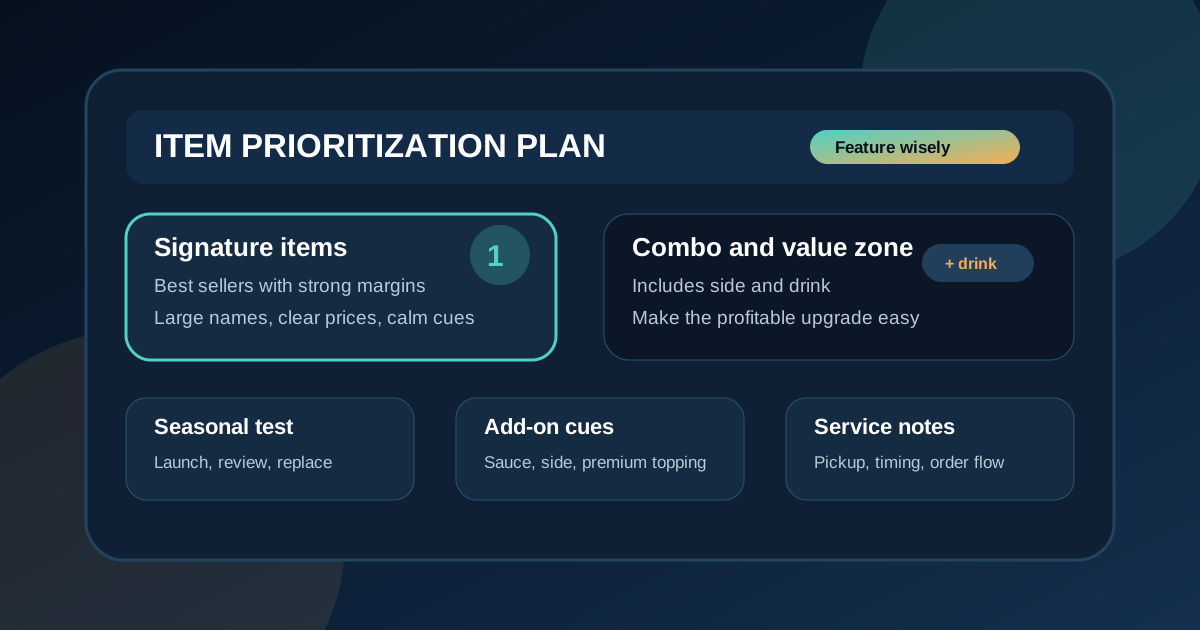
A digital menu board has more influence than a printed list because it controls what guests notice first. In a busy restaurant, customers rarely read every line from top to bottom. They scan the biggest zones, compare a few prices, notice a photo or badge, and make a decision under pressure. If the board gives equal weight to every item, the restaurant gives up a useful opportunity: guiding attention toward the items that should sell first.
Item prioritization is the process of deciding which dishes, drinks, combos, and add-ons deserve the best menu real estate. It is not about hiding choices or pushing guests into something they do not want. It is about making the most helpful, profitable, and operationally reliable choices easier to see. A good prioritization plan helps guests order faster, supports margins, reduces staff explanations, and keeps the board from turning into a crowded catalog.
Start with the job of each menu zone
Before choosing which items to feature, decide what each area of the board is supposed to do. A strong digital menu layout usually has a primary decision zone, supporting category zones, a specials or seasonal zone, a combo or value zone, and a small service note area. Each zone should have a clear job.
The primary decision zone is where the most important items belong. These might be best sellers, signature dishes, high-margin items, or meals that represent the brand well. Supporting zones help guests compare the rest of the menu. The specials zone creates freshness. The combo zone simplifies value decisions. The service note area handles information such as pickup directions, daypart timing, or order instructions.
When zones have jobs, prioritization becomes easier. Instead of asking, "Can we fit this somewhere?" ask, "Which zone does this item belong in, and does it deserve that amount of attention today?" That question prevents the common mistake of adding one more badge, one more photo, and one more featured tile until nothing feels featured.
Choose priority items with more than popularity
Best sellers are a useful starting point, but they should not be the only priority. Some popular items have low margins. Some profitable items slow the kitchen when ordered in high volume. Some items are loved by loyal guests but confusing for first-time customers. A practical prioritization list should consider several factors.
Look at sales volume, gross margin, prep time, ingredient availability, customer questions, visual appeal, and operational reliability. A great featured item usually scores well on most of those. It sells consistently, supports profit, photographs well, is easy for guests to understand, and does not disrupt the line when demand increases.
Restaurants should also identify items that should not be featured, even if they remain on the menu. If an item has inconsistent prep, limited ingredients, a weak margin, or requires a long explanation, it may belong in a regular category instead of the hero zone. The board can still include it, but it does not need the loudest placement.
Give signature items a clear visual advantage
Once priority items are selected, they need a visible advantage. That advantage can be size, position, photo placement, a short label, a border, or a dedicated tile. The goal is to make the item easier to notice without making it feel like an advertisement that fights the rest of the menu.
For example, a fast-casual restaurant might feature three signature bowls across the top row with larger item names, clear prices, and one concise ingredient line. A pizza shop might feature a best-selling specialty pizza with a photo and a short "customer favorite" cue. A coffee shop might highlight two seasonal drinks beside the regular espresso menu.
Keep the treatment consistent. If every priority item uses a different color, badge, and layout, guests have to decode the board instead of ordering. A simple featured-item pattern teaches guests where to look first and makes future updates easier.
Use photos only where they improve the decision
Photos are powerful, but they should not be assigned randomly. A photo should help guests understand value, portion, texture, or appeal. It should also support the item the restaurant actually wants to sell. If the most visible photo shows a low-margin item, the board may be training guests to choose the wrong thing.
Use photography for items that are visually distinct and easy to recognize from a distance. Burgers, pizzas, bowls, specialty drinks, desserts, and colorful seasonal items often work well. Avoid using a photo for every category unless the layout has enough space to protect readability. Too many images can make the board feel like a collage and make prices harder to compare.
Every photo should have a purpose. It can introduce a new item, make a premium option feel worth the price, show portion size, or make a combo easier to understand. If the photo does not improve confidence or encourage a profitable choice, text may be the better use of space.
Prioritize combos by decision speed and margin
Combos deserve careful placement because they can simplify ordering and increase average ticket size. The best combo is not always the biggest discount. It is the package that guests can understand quickly and the restaurant can fulfill consistently.
Feature combos that answer the main comparison questions: what is included, what can be upgraded, and how much it costs. If the restaurant wants to move guests from single items to meals, place the combo near the related item instead of separating it in a distant corner. A burger category, for example, can show the base item and a clear "make it a meal" cue in the same reading path.
Do not make every item a combo candidate on the main board. That creates clutter and can slow decisions. Choose the combinations that are easiest to explain, most profitable, and most useful during peak service. Less visible options can still be handled by staff or secondary menus.
Rotate seasonal items with a deadline
Seasonal items need attention, but they should have an exit plan. Without one, old specials linger on boards after the promotion has lost momentum, ingredients change, or staff stop mentioning the offer. A seasonal priority zone should include a launch date, review date, and removal or replacement date.
During the first week, give the item enough visibility to get a fair test. Track sales, staff feedback, ingredient usage, and guest questions. If the item performs well, keep it featured for the planned period. If it creates confusion or does not sell, adjust the name, price cue, photo, or placement before declaring it a failure.
Seasonal prioritization works best when the rest of the board stays stable. Guests should notice what is new without losing the familiar path to regular favorites. A controlled rotation keeps the menu fresh while protecting order speed.
Protect readability for lower-priority items
Prioritization does not mean lower-priority items should be hard to read. Guests still need to find them, compare prices, and order confidently. The difference is that these items can use simpler formatting: smaller tiles, fewer photos, no badges, and standard category placement.
This is where discipline matters. If the restaurant keeps adding visual emphasis to secondary items because someone feels they are being ignored, the hierarchy collapses. A menu board can only guide attention if some elements are quieter than others. Standard items should be clear, organized, and easy to scan, but they do not need to compete with the featured zone.
A good test is to step back and ask what the board recommends in the first five seconds. If the answer is obvious and sensible, the hierarchy is working. If the eye jumps everywhere at once, the board needs fewer competing signals.
Review priority choices every month
Menu prioritization should be reviewed on a schedule, not only when there is a crisis. A monthly review is enough for many restaurants. Look at what sold, what was profitable, what staff had to explain, what slowed the kitchen, and what guests ignored. Then adjust the featured items, photos, combo cues, or seasonal zone for the next cycle.
The review does not have to be complicated. Pick three items to keep featured, one item to test, one item to reduce, and one cue to clarify. Over time, these small changes create a menu board that reflects real guest behavior instead of old assumptions.
Digital menu boards are valuable because they can change as the business learns. When item prioritization is intentional, the board becomes more than a list. It becomes a selling tool that still respects the guest. Feature the items that deserve attention, keep the reading path calm, review performance often, and let the menu guide customers toward choices that work for them and for the restaurant.
Want a menu board that promotes the right items?
Zenith Digital Menus designs restaurant digital menu boards with clear hierarchy, readable prices, practical feature zones, and update workflows that keep priority items current. Contact us to plan a board that guides attention without clutter.