Restaurant Menu Board Readability for Speed: Help Guests Decide Faster
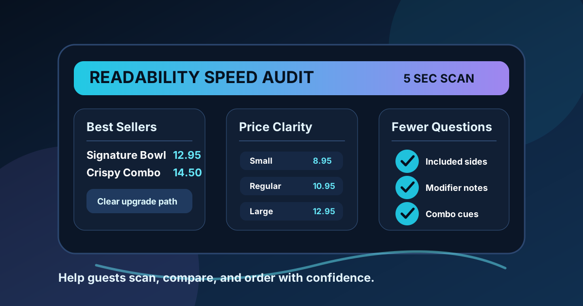
A readable menu board does more than look clean. It helps guests make a decision before they reach the cashier, keeps the line moving, and reduces the number of questions staff have to answer during rush periods. When a restaurant menu is hard to scan, guests pause, compare too many choices, miss the best offers, and sometimes order something safe instead of something profitable.
Speed is not about rushing people. It is about removing avoidable friction. A guest should be able to see the main categories, understand the most popular choices, compare prices, notice helpful upgrades, and confirm modifiers without studying the screen like a contract. The best digital menu boards feel calm because the important information is easy to find.
Use this guide to audit a dine-in, counter service, drive-thru, or QR-connected menu board for faster decisions and fewer missed sales opportunities.
Design around the first five seconds
Most guests start by looking for orientation, not details. They want to know where breakfast ends, where bowls start, which panel has drinks, or whether the special is worth considering. If the first five seconds are confusing, the rest of the board has to work harder.
Give each screen or zone a clear job. One area can introduce the best sellers, another can carry the core menu, and another can show add-ons or drinks. Avoid putting every category at the same visual weight. If everything is loud, nothing guides the eye. A fast menu board uses contrast, spacing, and headings to show guests where to begin.
- Make category names larger and simpler than item descriptions.
- Keep best sellers or signature items in a consistent, high visibility area.
- Use one featured offer at a time instead of stacking several competing promos.
- Place required ordering details near the item, not in a tiny note at the bottom.
Reduce the number of decisions per screen
A menu board that lists every item, size, modifier, topping, sauce, and disclaimer may feel complete, but it can slow ordering. Guests need enough information to choose with confidence, not every possible operational detail at once. The goal is to group choices so the decision path feels natural.
Start with the major choice: entree, combo, drink, dessert, or seasonal item. Then show the most common modifiers only where they affect the purchase. For example, a burger board can show core burgers, a clear combo upgrade, and a short add-on line. It does not need to show every sauce on the primary screen if staff or the QR menu can handle sauce selection later.
For digital menus with multiple screens, split content by decision stage. Let the first screen answer what to order. Let the second screen answer what to add. Let a smaller zone handle loyalty, catering, or limited time messages. This keeps the guest from jumping between unrelated choices.
Make prices easy to compare
Price clarity is one of the fastest ways to build trust. Guests should not have to hunt for the price, guess whether a combo includes a drink, or calculate the value of an upgrade while the line waits behind them. Put prices close to item names and keep the alignment consistent within each category.
If sizes or combos are important, show them in a comparison format. A simple small, regular, and large column is easier to scan than repeating the same item three times. For pizza, bowls, plates, or drinks, label whether the displayed price is a starting price or a full price. If premium proteins, toppings, or substitutions cost extra, make that visible before checkout.
Do not hide price changes inside decorative badges. A badge can call attention to value, but the actual number should still be readable from the ordering position. During an audit, stand where guests stand and compare three prices in a row. If you have to lean forward or reread a line, the layout needs more spacing or stronger type.
Use photos as decision shortcuts
Photos can speed ordering when they answer a real question. A good image shows portion style, texture, color, or build. A weak image takes space without helping the guest decide. On a crowded board, every photo should earn its spot.
Feature a small number of high-value or high-confidence items instead of adding a photo for everything. Use photos for signature dishes, new seasonal items, premium combos, or items that are often misunderstood. Keep the image close to the item name and price so guests connect the picture to the purchase. If the photo sits far away from the text, it becomes decoration rather than a shortcut.
Consistency matters too. Mixed lighting, mismatched crops, and different backgrounds can make the board feel noisy. A simple photo style helps guests scan faster because they are not processing a new visual language with every item.
Write descriptions that answer ordering questions
Long descriptions slow the board down, but vague labels create questions. The sweet spot is a short phrase that explains the decision. Instead of listing every ingredient, focus on what changes the order: spice level, included side, portion size, preparation style, or the reason the item is popular.
For example, "crispy chicken, house slaw, spicy honey" is easier to use than a paragraph of ingredients. "Includes fries" is more useful than a decorative slogan. If guests regularly ask the same question, the menu description should probably answer it. Staff questions are a direct signal that the board is missing a readability cue.
Keep motion and rotation under control
Digital boards can rotate content, but movement should never make the menu harder to use. If the main menu disappears while a guest is deciding, the board has interrupted the order. If a promo slide changes too quickly, the guest may notice motion without understanding the offer.
Use rotation for secondary content: seasonal announcements, catering reminders, loyalty messages, or limited time offers. Keep core ordering information visible most of the time. If a menu has to rotate, time the loop from the guest perspective. A person should not need to wait through several slides just to compare lunch options or confirm a price.
Audit readability during real service
The best test happens when the restaurant is busy. Watch where guests pause, what they ask, and whether they step closer to the screen. Notice if staff point at the board, repeat combo rules, explain sold-out items, or clarify prices. Those moments reveal the exact places where readability is costing time.
Create a simple weekly audit. Pick three orders and trace how a guest would find them on the board. Check one best seller, one combo, and one item with modifiers. Confirm that the item name, price, included items, and upgrade path are visible from the ordering position. Then ask staff which menu question they answered most often that week.
Small changes add up quickly. A clearer heading, better price alignment, fewer competing promos, a stronger photo, or a shorter description can remove seconds from each order. During a lunch rush, those seconds matter. They can reduce line pressure, improve staff confidence, and help guests choose the items you most want to sell.
Build speed without making the menu feel bare
A fast menu board does not have to be plain. It can still feel branded, appetizing, and energetic. The key is to separate design from clutter. Brand colors, quality photos, helpful icons, and clear feature zones can make the menu more useful when they support the order path. They become a problem only when they compete with the information guests need.
Readability is a revenue tool because it shapes what guests notice first and how confidently they order. When the board is easy to scan, popular items get seen, premium upgrades feel understandable, and staff spend less time translating the menu. That is the real value of menu board design: not just a better looking screen, but a smoother buying experience.
Need a clearer digital menu board?
Zenith Digital Menus designs and manages restaurant menu boards that are built for readability, faster ordering, seasonal updates, and practical upsells.
Start Your Menu Project